ConstraintLayout
一些说明
有人可能好奇 android 定位 除了 left right top bottom 外还有 start end
而 start end 和 left right 在布局里看感觉一模一样,其实是有一些区别的,引入start end 就是为了适配google的RTL模式(适配一些国家看文字是从右往左读的),开发者选项中 选中 强制使用从右到左的布局方向 就能看到效果,想要支持RTL除了 start end 外 还要在manifest 加上android:supportsRtl=”true” 新项目已经默认打开。
导入
其实新版本的android studio 已经默认导入了
使用
注意 constraint-layout 中文翻译是约束布局 这代表定位只是相对约束而已 例如控件A的右边约束在控件B的左边 加入控件B的宽度大于可用控件则是会覆盖住控件A的
定位方式
| 定位 | 说明 |
|---|---|
| layout_constraintLeft_toLeftOf | 控件的左侧在另一个控件的左侧 |
| layout_constraintLeft_toRightOf | 控件的左侧在另一个控件的右侧 |
| layout_constraintRight_toLeftOf | 控件的右侧在另一个控件的左侧 |
| layout_constraintRight_toRightOf | 控件的右侧在另一个控件的右侧 |
| layout_constraintTop_toTopOf | 控件的顶部在另一个控件的顶部 |
| layout_constraintTop_toBottomOf | 控件的顶部在另一个控件的底部 |
| layout_constraintBottom_toTopOf | 控件的底部在另一个控件的顶部 |
| layout_constraintBottom_toBottomOf | 控件的底部在另一个控件的底部 |
| layout_constraintBaseline_toBaselineOf | 控件文字的基线对齐另一个控件文字的基线 |
| layout_constraintStart_toEndOf | 控件的开始在另一个控件的结尾 |
| layout_constraintStart_toStartOf | 控件的开始在另一个控件的开始 |
| layout_constraintEnd_toStartOf | 控件的结尾在另一个控件的开始 |
| layout_constraintEnd_toEndOf | 控件的结尾在另一个控件的结尾 |
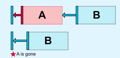
GONE MARGIN
被绑定的控件的visibility为gone的时候使用的外边距
水平和垂直的偏移
当一个控件设为 左右or上下绑定的时候很多情况下在两个就是居中的(想象成橡皮筋)而
就是用来控制水平or垂直的偏向的 0为完全偏左or上 1为完全偏右or下
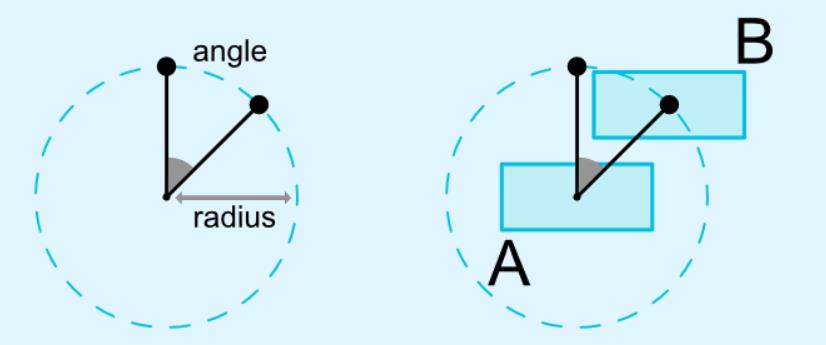
圆形定位(1.1以上版本才有)
https://developer.android.com/reference/android/support/constraint/ConstraintLayout 图片
| 参数 | 说明 |
|---|---|
| layout_constraintCircle | 被绑定圆形定位的控件 |
| layout_constraintCircleRadius | 离被绑定圆形定位的控件的中心的距离 |
| layout_constraintCircleAngle | 放置在被绑定圆形定位的控件的角度0-360 0是最上方 |
尺寸限制
宽高使用0dp,相当于 MATCH_CONSTRAINT 控件设为自己所能达到的最高最宽
当宽or高为wrap_content可用
强制约束
当控件的包裹内容过多的时候会超出约束的位置时可以使用
MATCH_CONSTRAINT 限制尺寸(1.1以上版本才有)
当尺寸设为MATCH_CONSTRAINT时
宽高比
当宽高至少一个尺寸设为MATCH_CONSTRAINT可用
链
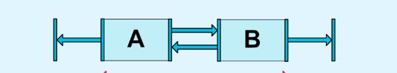
有一种情况 几个控件宽or高都不确定 又相互连接在一起,这就叫链。
在链中的元素上使用边距时,边距是附加的。
例如,在水平链上,如果一个元素定义了10dp的右边距而下一个元素定义了5dp的左边距,则这两个元素之间产生的边距为15dp。
链类型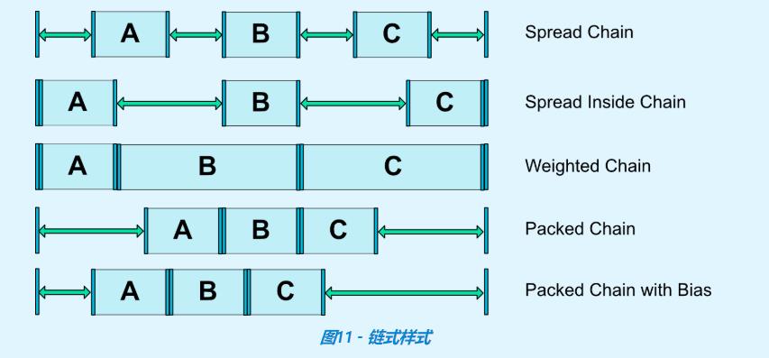
优化器 (1.1以上版本才有)
|
|
FlexboxLayout
google 开源地址
https://github.com/google/flexbox-layout
所用图片来源于
https://css-tricks.com/snippets/css/a-guide-to-flexbox/
相对于布局
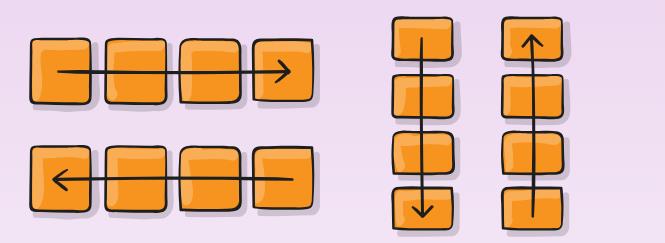
主轴方向(flexDirection)
| 参数 | 说明 |
|---|---|
| row (默认) | 水平主轴,从左到右 |
| row-reverse | 水平主轴,从右到左 |
| column | 垂直主轴,从上到下 |
| column-reverse | 垂直主轴,从下到上 |
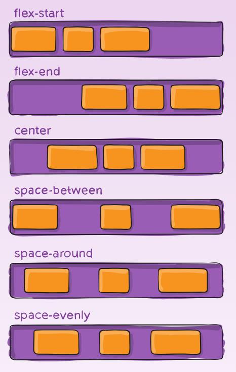
主轴对齐(justifyContent)
| 参数 | 说明 |
|---|---|
| flex_start(默认) | 左对齐 |
| flex_end | 右对齐 |
| center | 居中 |
| space_between | 两端对齐 |
| space_around | 每个控件两侧的间隔相等 |
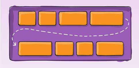
换行(flexWrap)
| 参数 | 说明 |
|---|---|
| nowrap(默认) | 不换行 |
| wrap | 换行 第一行在最上面 |
| wrap_reverse | 换行 第一行在最下面(不支持RecyclerView) |
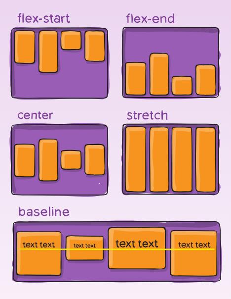
交叉轴对齐-对于内部控件(alignItems)
每换一次行就会平分一条交叉轴线
| 参数 | 说明 |
|---|---|
| stretch(默认) | 如果控件高度为wrap_content 则占满布局高度 |
| flex-start | 交叉轴起点对齐 |
| flex-end | 交叉轴终点对齐 |
| center | 交叉轴中间对齐 |
| baseline | 与每条交叉轴的第一个控件的文字基线对齐 |
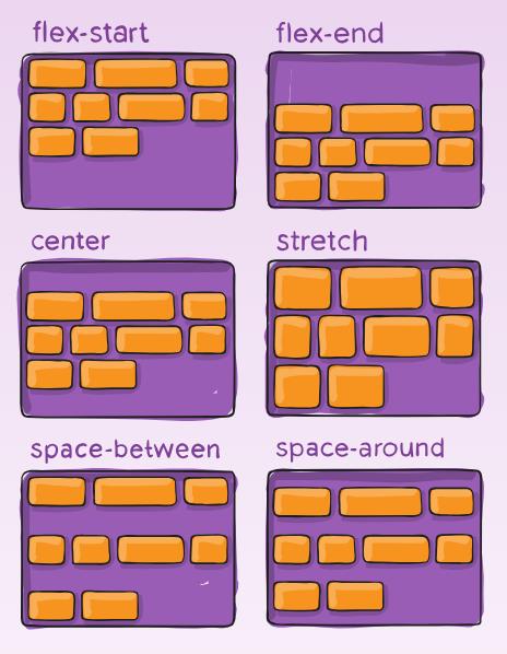
多条交叉轴线的对齐-对于交叉轴(不支持RecyclerView)(alignContent)
| 参数 | 说明 |
|---|---|
| stretch(默认) | 每条轴线占满 |
| flex-start | 轴线起点对齐 |
| flex-end | 轴线终点对齐 |
| center | 轴线中间对齐 |
| space_between | 轴线两端对齐 |
| space_around | 每根轴线两侧的间隔都相等 |
显示分割线
|
|
相对于内部控件
|
|