Toolbar
简单使用
注意
android.support.v4.widget.NestedScrollView
android.support.v7.widget.RecyclerView
在MD中,RecyclerView代替了ListView,而NestedScrollView代替了ScrollView
配置
首先把默认带的ActionBar取消
其中 Theme.AppCompat.NoActionBar表示深色主题,它会将界面的主体颜色设成深色,陪衬颜色设成淡色。而 Theme.AppCompat.Light.NoActionBar 表示淡色主题,它会将界面的主体颜色设成淡色,陪衬颜色设成深色。
styles.xml
styles.xml的更多参数参考此图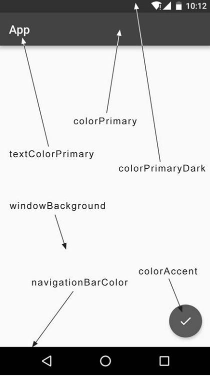
放进布局文件
|
|
这里使用 xmlns:app 指定了一个新的命名空间。思考一下,正是由于每个布局文件都
会使用 xmlns:android 来指定一个命名空间,因此我们才能一直使用 android:id android:
layout_width 等写法,那么这里指定了 xmlns:app ,也就是说现在可以使用 app:attribute
这样的写法了。但是为什么这里要指定一个 xmlns:app 的命名空间呢?这是由于 Material Design是在 Android 5.0系统中才出现的,而很多的 Material属性在 5.0之前的系统中并不存在,那么为了能够兼容之前的老系统,我们就不能使用 android:attribute 这样的写法了,而是应该使用app:attribute 。
android:theme 是 toolbar标题的主题,默认和styles.xml指定的相同(深色主题字体为白,浅色为黑)
app:popupTheme 属性单独将弹出的菜单项指定成了淡色主题,默认和android:theme的相反。(深色主题黑底白字,浅色白底黑字)
添加按钮和菜单
右击 res目录→New→Directory,创建一个 menu文件夹。然后右击
menu文件夹→New→Menu resource file,创建一个 toolbar.xml文件
在java文件使用
|
|
带伸缩的toolbar
效果
需要AppBarLayout套着Toolbar,然后CoordinatorLayout套着AppBarLayout以及要滑动的布局,在被滑动的布局写上 。
app:layout_behavior="@string/appbar_scrolling_view_behavior"
这里的app:layout_scrollFlags值指定成了scroll|enterAlways|snap 。其中, scroll 表示当 RecyclerView 向上滚动的时候,Toolbar 会跟着一起向上滚动并实现隐藏; enterAlways 表示当 RecyclerView向下滚动的时候,Toolbar会跟着一起向下滚动并重新显示。 snap 表示当 Toolbar还没有完全隐藏或显示的时候,会根据当前滚动的距离,自动选择是隐藏还是显示。
|
|
可折叠式toolbar
注意:都没在android4.4做过测试...
知识背景
需要三层嵌套..
CoordinatorLayout
我们通常把CoordinatorLayout作为顶层布局来协调其子布局之间的动画效果。
AppBarLayout
AppBarLayout继承自LinearLayout,布局方向为垂直方向。所以可以把它当成垂直布局的LinearLayout来使用。当CoordinatorLayout发生滚动手势的时候,AppBarLayout的子View通过在布局中设置app:layout_scrollFlags属性,来发生相应的滚动。
app:layout_scrollFlags属性的具体参数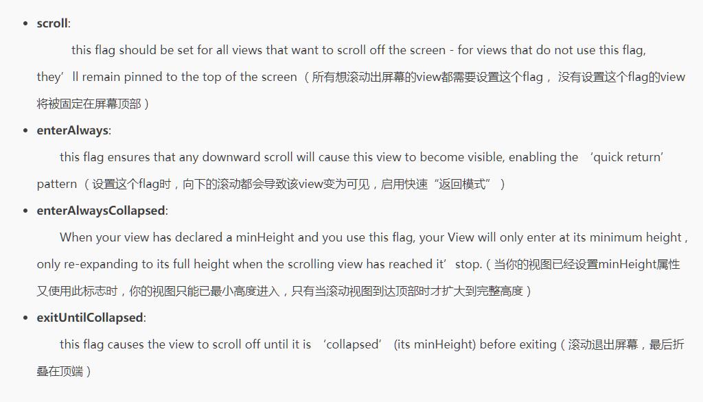
CollapsingToolbarLayout
app:collapsedTitleTextAppearance 展开时Title文字外形设置 如:”app:expandedTitleTextAppearance=”@style/expandedTitle””
app:collapsedTitleGravity 展开时的标题如何放置
app:contentScrim 标题文字停留在顶部时候背景的设置 如:”app:contentScrim=”?attr/colorPrimary””
app:expandedTitleMarginStart 展开时title向左填充的距离
app:expandedTitleMarginEnd 展开时title向右填充的距离
app:expandedTitleMarginTop展开时title向上填充的距离
app:expandedTitleMarginBottom展开时title向下填充的距离
CollapsingToolbarLayout的子布局有3种折叠模式
(Toolbar以及展开的界面中设置的app:layout_collapseMode)
off:这个是默认属性,布局将正常显示,没有折叠的行为。
pin:CollapsingToolbarLayout折叠后,此布局将固定在顶部。
parallax:CollapsingToolbarLayout折叠时,此布局也会有视差折叠效果。
当设置了parallax模式时,我们还可以通过app:layout_collapseParallaxMultiplier设置视差滚动因子,值为:0~1。
效果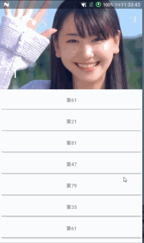
设置状态栏透明
在相对应的styles.xml 加上一句
<item name="android:windowTranslucentStatus"> true </item>
设置折叠toolbar
|
|
加多个 FloatingActionButton
FloatingActionButton的app:layout_anchor要设为AppBarLayout的id